

I’m getting married next year, and one of those things you need to have nowadays is a wedding website. There are a ton of dedicated tools for this (The Knot set one up for me without me even noticing!) but being a UX designer, and engaged to a software engineer, we wanted to design and build our own.
The users
This project was unique, because, contrary to everyday experience, I know personally every single one of our target users. Their ages range from early 20s to late 80s, mostly USA based English speakers. They mostly use Apple products (they tease me about my Pixel phone!), are heavy mobile users (even the ones in their 80s!) and have no major accessibility issues.
We expect people to look at this website only a handful of times, under a few circumstances:
Use case 1: When they get the Save the Date, and go to the website to check it out. Not looking for any information in particular.
Use case 2: Users go to the website seeking registry information.
Use case 3: Users go to the website for details on the wedding day (start time, location, dress code).
Based on research (aka, talking to our friends and loved ones), we found that individuals tend to open the wedding website on their phone on the wedding day when looking for the venue, but were more split between desktop and phone for other cases. We also knew of at least one user who exclusively uses a tablet.
Design goals
As with any design project, our users and use cases came first, before any petty desires to “have the best website” or “be awesome”. Obviously.
We wanted to have a great experience for our loved ones, where they would be able to find the information they needed quickly. We made some architecture choices soon in the process to support a great experience:
- Easy to find website name. We bought the domain deflumeriker.com, but in case people forgot the exact domain, we redirected different combinations of our last names, “DeFlumeriRiker.com” and “RikerDeFlumeri.com”, to the site as well.
- No password protection. Our users already had to remember the domain name. We decided to not password protect the site and instead limit the amount of personal information we shared. We did not include information about our families or wedding party on the site.
- Static, single page design. Use case #1 is all about browsing, but #2 and #3 are about finding specific information. To support this, we did a single page design with navigation using anchor tags. We also chose to have a completely static website and build it only with HTML/CSS/Javascript to make our own lives easier.
- Full mobile support. This is a given in this day and age, but we made sure that people had the same full experience on desktop and mobile.
Design process
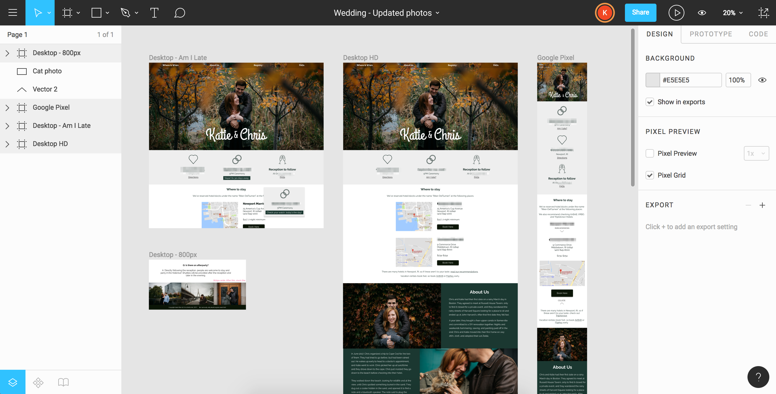
Day-to-day, I’m usually in Adobe Illustrator, so when the chance comes to learn a different tool I take it! I’ve done a few projects in Sketch, but I read an article about Figma and was intrigued. After some rough sketching on paper, I dove in and created the first version of the website:

The layout is pretty basic. There’s a big hero image, some top navigation, various sections delineated by blocks of color. This layout is common in a lot of wedding websites (and in general) so it hasn’t changed much since V1.
However, I’ve made a few changes based on aesthetics and usability:
- Cohesive photography & updated color palette. Instead of amateur selfies, we had professional photos taken, and then updated the color palette to better match the photos.
- Remove date from hero image. Showing both the long-form date and our names in mobile ended up blocking most of the photo. Instead, I moved the date to directly below the photo in a new “quick details” section.
- “Quick details” section. The original version has a lot of space dedicated to showing a map of where the wedding and reception takes place. This turned out to not be the most effective way to use that prime real estate. Instead, I added a “quick details” section that showed the information in a more compact way.
- More focus on hotel blocks. Guests are taking a shuttle from their hotel to the venue, so in lieu of giving a giant map of the venue’s location, the new design focuses on the location of the hotels instead. That’s what people are going to be punching into their GPS!
- Addition of a FAQ section. To answer all those little questions, and add a little humor, I added a FAQ section at the bottom of the page.
Building the website
After getting many requests for information from friends and family, I took an afternoon and built out the HTML and CSS for the site. The development team (aka my fiancé Chris) extended it to add JavaScript to improve the navigation, clean up a bit, and add some fun features.
The “final” product
The “final” design is currently up at www.deflumeriker.com or you can take a look at the Figma file here.

There are some pending changes, most notably a redesign of the “About Us” section. (This was a problem of it looking great in a mock-up and small screens, and then not-so-great on large screens.)
However, this project was a blast! Having myself as the key stakeholder, project manager, and designer, and a very patient and talented developer on call 24/7, was a very nice set-up.
Leave a Reply