

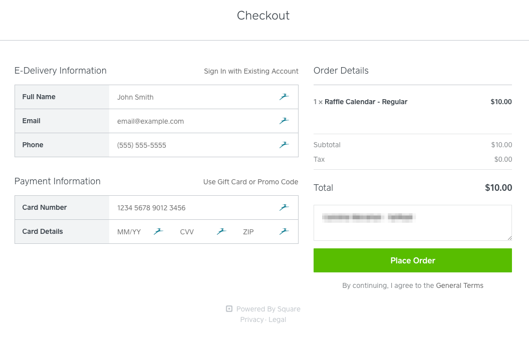
I was buying a charity raffle ticket, and ended up on this screen:

Those gazelle icons are from my password manager (Dashlane), and when I opened this page I was pleasantly surprised to see my payment details all filled in. Either my password manager or the Square payments filled it all in! Excellent!
Except it’s not my data. It’s all placeholder and I still needed to type all my own information into the form.
This was confusing and a bad experience.
Placeholder data
Instead of having placeholder data easily confused with actual data, Square could have:
- Had no placeholder data at all
- Had helper info under the fields
- Styled the placeholder data in a way that doesn’t look like entered data
Placeholder data is commonly confused with actual information. Caroline Jarrett has a great example of how this can go wrong:
“Participants in the study had to create two records for new customers… The first field had the label Customer name and the hint text New customer. [The participant] skipped right over that field—because it was already filled in—filled in the rest of the form with Mr. Smith’s details, and clicked Send, creating a new customer record. This worked, so next he tried repeating the same actions for Mr. Jones. This time, that failed, because he’d tried to create another record with Customer name: New customer. As is usual with usability defects of this type, I then had to endure seeing participant after participant make exactly the same mistake.”
This is an older example, and using the HTML “placeholder” attribute mitigates this specific issue, but the behavior (“This is a filled in field”) is the same.
The Square checkout doesn’t need the placeholder text for a user to understand what the form is. It only adds confusion.
On a different note,
I do like the overall layout of the screen. In my form study, we found that people did were quick to fill, and preferred, a “two stacked” layout over other types. However, we found it to be incredibly error-prone for the use cases we were studying. In the form study, users had issues when sections were different heights, or sections were long. They would miss fields and entire sections. But this form is short, and the columns are evenly matched in height, making it a good execution of this pattern.

Leave a Reply