Most research into forms is focused on B2C and sign-up forms. It makes sense: there’s a lot of data there, and conversions are a good metric to watch. However, in the B2B, and especially the enterprise space, there is not a lot of research to look at.
For enterprise forms, the same best practices apply as consumer forms… but enterprise differs:
- Users are being forced to use this form
- Users tend to see this same form again and again
- Users will learn tactics to get around the annoying parts
A great practice to follow when designing forms is to reduce the length. However, in an enterprise environment that may either be not possible, or have significant resistance.
With that in mind, I studied form speed as a level of success rather than form completeness.
To measure speed, I created a custom form test framework that timed users. Read about the form test framework.
Note: I authored a post on Pega’s blog about this topic. See it here
What we tested
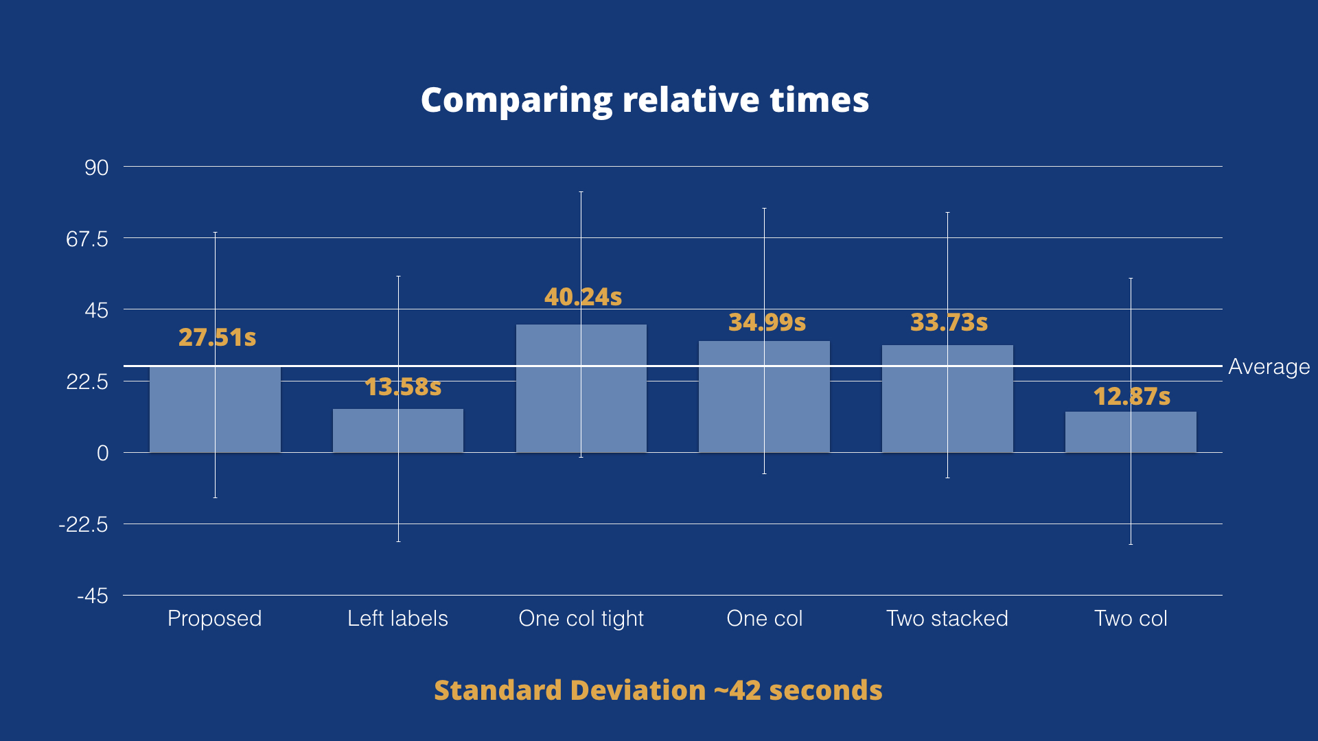
We tested six different form designs against each other, including our “proposed” design.
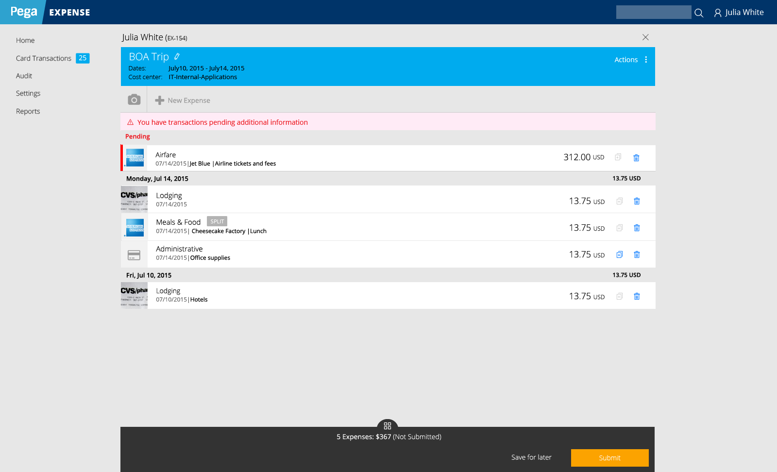
- Proposed: Logically grouped fields are put together. Labels on top.
- Left labels: No special grouping. Left labels.
- Two stacked: Sections were in a single column, but the next section appeared in a second column.
- Two column: Form was in a two column layout.
- One column: Form was in a one column layout. Labels on top.
- One column tight: Same as one column, except for spacing is reduced.
A pilot group of 17 people preceded a full test of 101 remote, unmoderated participants.


Speed results


To simulate familiarity, each participant filled in the form three times. The first as a practice, and the second two were random conditions. The time from the third form fill was used to examine.
“Left labels” and “2 columns” were found to be statistically slower than the others. “Two stacked” was not statistically slower, but was error prone. There was no statistical difference between the one column variations.
Preference results
Apart from time, we also collected participant’s stated preference for form type. After reading through all the comments, it was clear that most people treated “One column” and “One column tight” interchangeably.
The most frequently preferred layout was the “proposed”, but “two stacked” came in a close second. From reading comments, people seemed to like “two stacked” (despite it being very error prone) because it took advantage of every inch of space and left very little whitespace.


Interpretation
As with most research, learning more simply opens more questions. Future research could dive into regional and educational differences, or more deeply into how people get familiar with forms.
However, it can be safely said from the results that the “proposed” design is a good path to try out. Since this test, we have taken the proposed design and reduced the spacing slightly in order to be more efficient in space (what people liked about “two stacked” and “one column tight”).